Tea & Teaware Guides
Yixing Teapot Mark: Seals and Calligraphy Explained
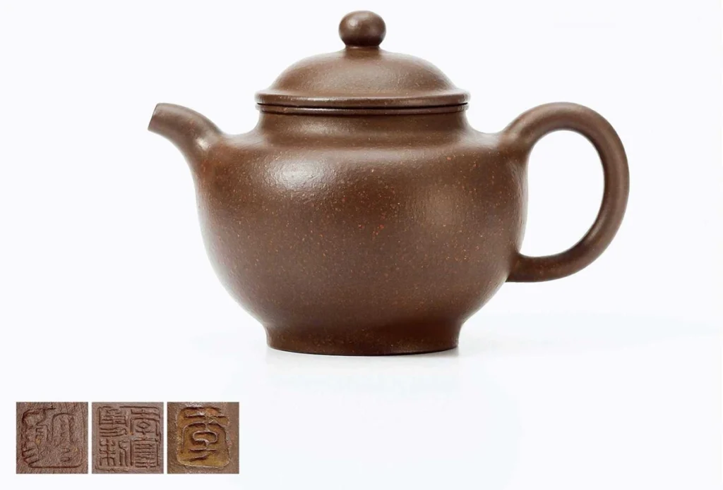
A Yixing teapot mark may be a stamped seal, an engraved signature or another inscription. Before trying to identify a name, work out what kind of writing you are looking at. A square mark under the base and a poem across the body serve different purposes, even when both use traditional Chinese characters.
This guide explains how seals differ from decorative calligraphy, then introduces the five main script styles used in Chinese writing. It is a way to look more closely at a Chinese Yixing teapot from Yixing, Jiangsu, China—especially when a seller’s description mixes the maker, carver, poem and script into one sentence.
Is it a maker’s mark or a decorative inscription?
Start with location and context. Look under the base, beneath the lid and around the handle for marks, then examine any writing on the body. A mark may refer to a maker, workshop, studio or another participant in the work. An inscription may contain a poem, an auspicious phrase, a dedication, a date or a carver’s signature. Its location is a clue, not a complete identification.
Keep three questions separate: What does the text say? What role does it have? What evidence supports its attribution? Reading a recognizable name does not establish that the named person made the pot. For seller claims, use our Yixing teapot authenticity checklist; for dating, see the vintage teapot guide.
The supplied photographs show pots and seal-detail insets. They help distinguish the appearance of a seal from writing spread across a body; they are not independently verified specimens for identifying a particular maker.
Five calligraphy styles to recognize
These are script families, rather than simply decorative fonts. Chinese writers continue to use seal, clerical, running, regular and cursive scripts. The Met’s introduction to Chinese calligraphy explains their development and continuing use. On a teapot, the written design is translated into lines on a curved clay surface.
1. Seal script — zhuanshu (篆书)
Seal script often has a compact, structured appearance, with curves and character forms that can look unfamiliar to readers of modern Chinese. It is an important script to recognize when examining a Yixing teapot mark. Small seal lettering can be difficult to separate into characters, particularly when arranged tightly within a square.
On the body, seal script can give a short motto or single character a formal, archaic feel. Leave enough space for the design to breathe. There is no universal character-count limit: the available surface, character complexity and lettering size matter more than a rule such as “no more than twenty characters.”
2. Clerical script — lishu (隶书)
Clerical script often emphasizes broad character shapes and strongly articulated horizontal strokes. Some strokes end in a noticeable sweep or flare. That measured rhythm can work well for tea couplets and short poems. Different engravers interpret its proportions and stroke endings in their own ways.
Look at the spaces between characters as carefully as the lines themselves. A broad character needs a layout that accommodates its width. Its success on a Chinese tea pot depends on the composition, not on one prescribed clay color.
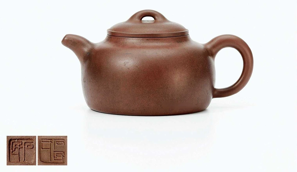
3. Running script — xingshu (行书)
Running script, also called semicursive script, connects the feeling of one stroke to the next while retaining more readable character structure than highly abbreviated cursive writing. It can suit a phrase, poem or personal inscription that needs a sense of movement across the pot.
When looking at engraving, follow a line from its start through its turns to its finish. Does the movement feel convincing on the curved surface? Changes in line width can contribute to that effect, but visible variation alone cannot prove a specific carving method or identify the artist.
4. Regular script — kaishu (楷书)
Regular script, also called standard script, has clearly articulated strokes and orderly character structures. It is useful when readability matters: a name, dedication or longer passage may benefit from a clear arrangement. That does not mean every signature or base mark must use regular script.
Watch the proportions within each character and the spacing between lines. A disciplined style can still feel lively. The question is whether the composition fits the vessel, rather than whether the lettering resembles a printed label.
5. Cursive script — caoshu (草书)
Cursive script uses abbreviated forms and connected movement. Its expressive rhythm can give a short inscription a strong visual presence, but it may need an experienced reader to decipher. It is a developed writing system, not simply untidy handwriting.
A brief phrase is often easier to accommodate than a crowded passage. Evaluate the relationships between the strokes and the empty spaces around them. Neither a rough clay texture nor a large body automatically makes cursive lettering successful.

A quick reference for inscription layout
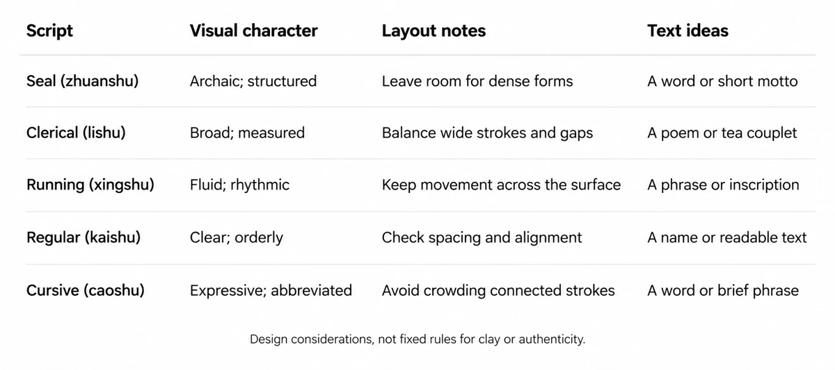
The chart below offers design considerations, not rules about which clay must accompany each script. The same style can appear on different colors and forms. Surface contrast, the usable writing area and the complexity of the text are more practical starting points.
Three things to examine in engraved calligraphy
- Line control. Examine the beginnings, turns and endings of strokes. Ask whether they support the intended script. Uniform lines can be a deliberate stylistic choice; they do not by themselves prove machine engraving.
- Rhythm and spacing. Step back from the individual characters. Check how the text moves across the surface and how closely the lines sit together. A small photograph may conceal the detail, so request an unfiltered close-up.
- Fit with the vessel. Compare the inscription with the shoulder, belly, spout and handle. Look for a comfortable reading area and enough empty space around the writing. For shape vocabulary, see our illustrated Yixing teapot shape guide.
Writing and modeled decoration can also coexist. The bamboo photograph above shows carved plant motifs alongside separate seal details. Those different elements should be described individually, rather than calling every surface mark calligraphy.
How to photograph and read a Yixing teapot mark
Take one photograph of the whole pot, then straight-on close-ups of each marked area. Include the base, underside of the lid and any handle marks that are present. Use soft light, keep the full border visible and try another light angle if the impression is hard to see. Save the original photographs; avoid filters that fill in missing strokes.
Establish the intended orientation before transcribing. Many traditional inscriptions are arranged in vertical columns read from right to left, but seal layouts vary. Work from the actual character arrangement rather than applying one reading order to every square stamp.
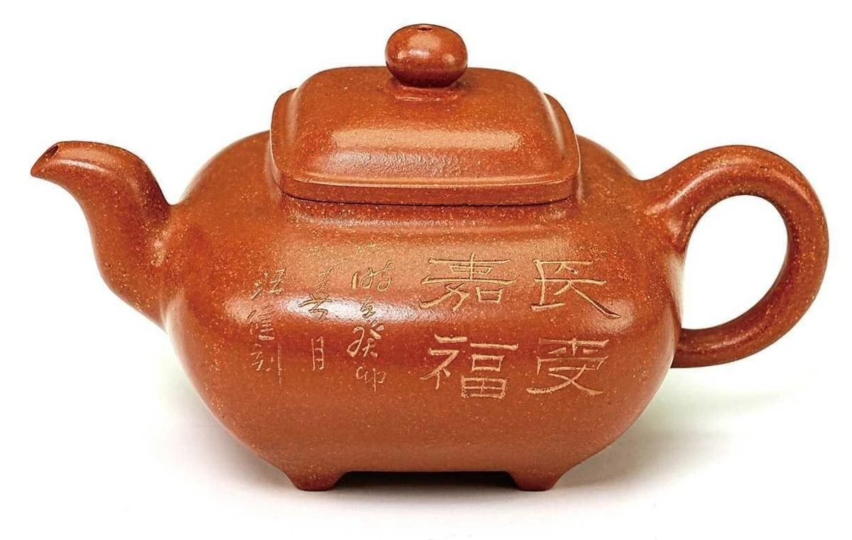
The last supplied photograph provides a readable example of body lettering: the large characters form 长受嘉福, read down the right column and then down the left. A natural English rendering is “May you long receive auspicious blessings.” This is a blessing, not a maker’s name. The smaller writing should be examined separately before assigning an author or date.
Why seals and inscriptions can appear together
Yixing pottery has a longstanding relationship with China’s literary and artistic culture. A National Museum of China record of a Chen Hongshou teapot describes running-script lettering on one side, seal-script lettering on the other and a studio seal underneath. It also discusses Chen Hongshou’s collaboration with potter Yang Pengnian. This is a documented museum example; it is not an attribution of the pots illustrated here.
Common questions
Does a Yixing teapot mark prove authenticity?
A mark is one piece of information. Its wording, the vessel and its documented history need to be considered together. A familiar name or seal design alone does not establish authorship, age or clay origin.
Can I identify the artist from a small seal photograph?
Sometimes the wording can be read, but reading and attribution are separate tasks. Ask for sharp original photographs and an explanation of whether the name refers to the potter, carver or workshop. Leave uncertain characters unresolved instead of guessing.
Which script works best on a small teapot?
There is no single answer. A short text, suitable character size and restrained layout can matter more than the script label. Compare the actual inscription at the pot’s real size.
Start by separating the seal from the inscription. Then look at the script, the layout and the evidence behind the name. That gives you a much firmer basis for understanding the writing on a Yixing teapot.